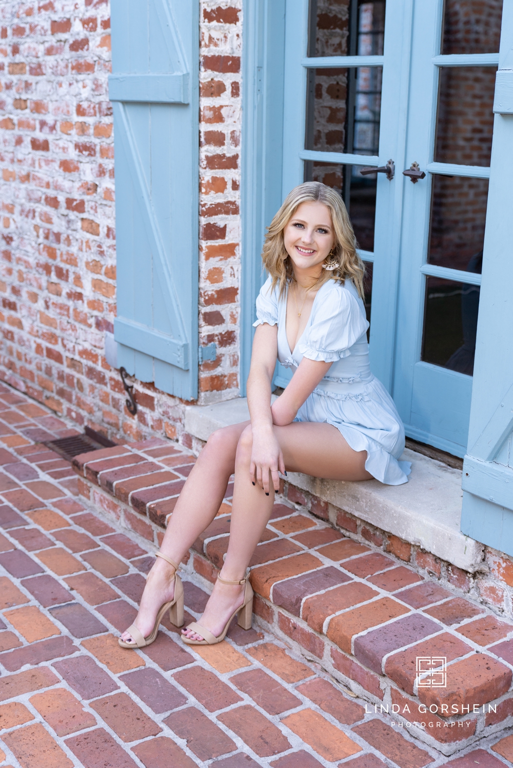
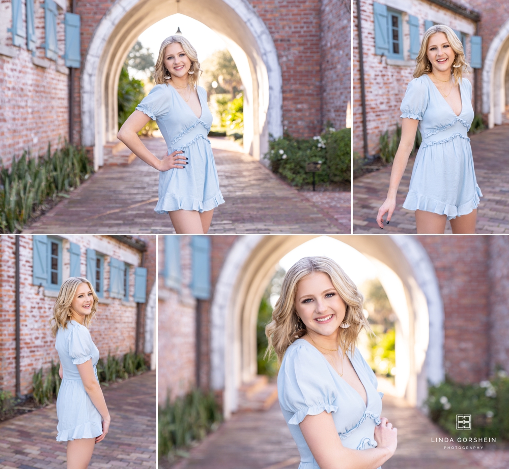
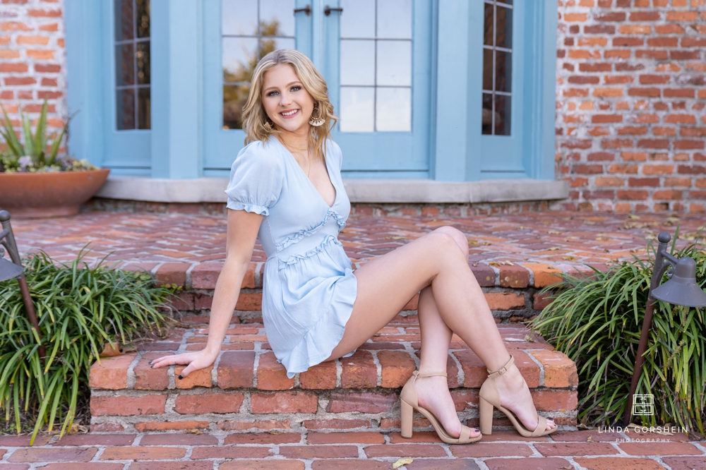
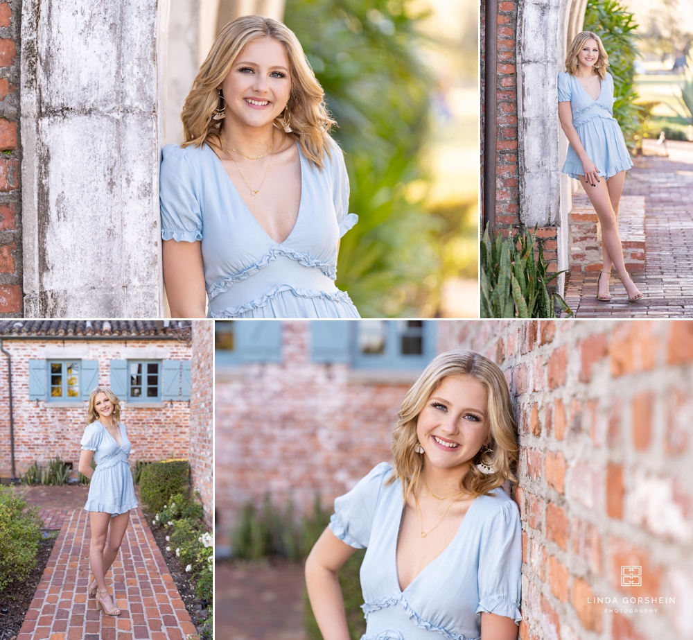
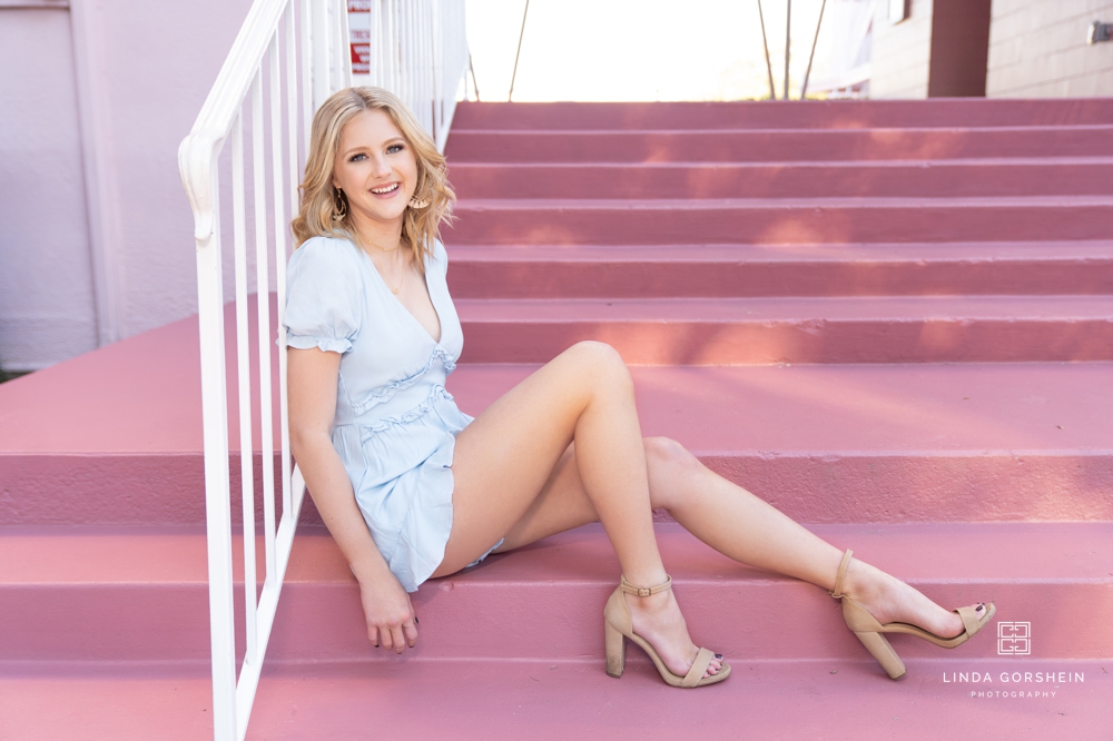
If you are considering a springtime senior session, you may be thinking about using pastels and traditional spring colors. Spring is a beautiful time of year in our area, and pastels can look gorgeous (as you can see on Caroline, below!), but I have a few tips to make these colors work for every senior:
- If pastels aren’t flattering on you, go with a jewel tone or slightly darker color of the same shade. Pastels can be tricky to pull off, depending on your skin tone or hair color, but you can navigate this by choosing a slightly darker color in most colors. If you find a piece you really love, you can create a workable look by anchoring it with a more flattering color nearest to your face (with something like a denim jacket or a blazer).
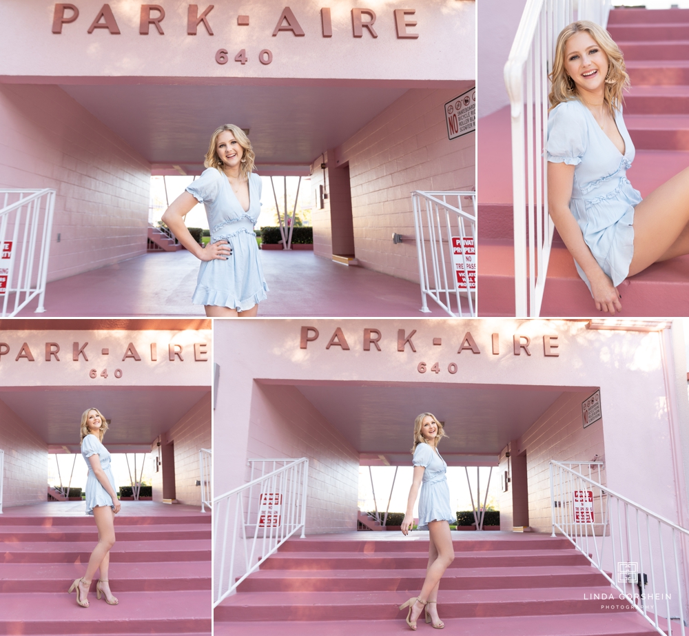
- Choose a gorgeous, flattering cut with a solid color: For Caroline, this elegant cut of dress was just right for her shoot. It created a uniform look that flattered the lines of her leg and heels, and kept things elegant and simple. I love the dress she chose, and the way it popped against the darker pink in the later shots.
Even if your session isn’t in the spring, pastels or lighter spring colors can work year round when they are worked into the right outfits. Caroline was so wonderful to work with, and is a graduate from Bishop Moore Catholic School. I was able to do her sisters senior photos a few years ago, and I really enjoy their entire family. Caroline loves going to the beach, and spending time with the people that she loves! Congratulations, sweet girl!